Darkhorse Analytics visualizes U.S. climate vulnerability
An Edmonton-based data visualization company has launched a new interactive map on climate vulnerability around the U.S. that aims to equip policymakers and communities with actionable insights.
Darkhorse Analytics built The U.S. Climate Vulnerability Index (CVI) to visualize the findings of Characterizing vulnerabilities to climate change across the United States, a study by Texas A&M University and the Environmental Defense Fund.
"Darkhorse has a history of working a lot in economic mobility and other areas of the social paradigm, but we've never done anything large in the environmental world," vice-president Craig Hiltz told Taproot. "Our mission is to use data science and data visualization to help make an impact in the world."
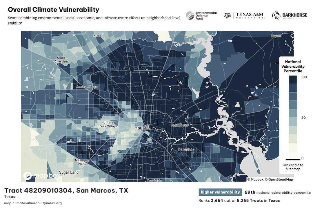
The CVI comprises 184 sets of data used to rank more than 73,000 census tracts on how vulnerable they are to the effects of climate change. The data sets are organized into numerous sub-categories split between baseline vulnerabilities that reduce community resilience and climate change risks that have a direct or indirect impact. Cumulatively, the dashboard offers ways to browse and filter data across the U.S. to gain insights on what is driving climate vulnerability where and by how much. Once users land on the data they're looking for, the tool generates a report with specifics.
"Finding a way to structure that in a tree-like form that our users can roam around fairly quickly was probably the biggest challenge on a design front," said Rob Korzan, the Darkhorse team member who led design. "Technically, it would be showing those data points at all 73,000-ish tracts in the U.S. and having the tool be performant … being able to click on a new indicator and seeing the map change without waiting for 10 seconds."
Taking data from a paper and visualizing it can help to reveal things that could otherwise go unnoticed.
"In Houston, for instance, we have this thing. We call it 'The Arrow,'" said Grace Tee Lewis, a senior health scientist with the Environmental Defense Fund. "There are some neighbourhoods that are clustered together. They form what looks like an arrow. And that's kind of like the dividing line between the haves and the have-nots."
The CVI uses a colour scale to indicate the intensity of climate vulnerability. But the ability to zoom in on specific indicators like access to care, socioeconomic stressors, pollution sources, and transportation helps unpack the "why."
"There are a lot of communities across the United States that are in need. And they may have the same CVI score, but the profile of what makes them vulnerable, cumulatively, can be really different," Tee Lewis said.


