Darkhorse Analytics visualizes U.S. climate vulnerability
An Edmonton-based data visualization company has launched a new interactive map on climate vulnerability around the U.S. that aims to equip policymakers and communities with actionable insights.
Darkhorse Analytics built The U.S. Climate Vulnerability Index (CVI) to visualize the findings of Characterizing vulnerabilities to climate change across the United States, a study by Texas A&M University and the Environmental Defense Fund.
"Darkhorse has a history of working a lot in economic mobility and other areas of the social paradigm, but we've never done anything large in the environmental world," vice-president Craig Hiltz told Taproot. "Our mission is to use data science and data visualization to help make an impact in the world."
The CVI comprises 184 sets of data used to rank more than 73,000 census tracts on how vulnerable they are to the effects of climate change. The data sets are organized into numerous sub-categories split between baseline vulnerabilities that reduce community resilience and climate change risks that have a direct or indirect impact. Cumulatively, the dashboard offers ways to browse and filter data across the U.S. to gain insights on what is driving climate vulnerability where and by how much. Once users land on the data they're looking for, the tool generates a report with specifics.
"Finding a way to structure that in a tree-like form that our users can roam around fairly quickly was probably the biggest challenge on a design front," said Rob Korzan, the Darkhorse team member who led design. "Technically, it would be showing those data points at all 73,000-ish tracts in the U.S. and having the tool be performant … being able to click on a new indicator and seeing the map change without waiting for 10 seconds."
Taking data from a paper and visualizing it can help to reveal things that could otherwise go unnoticed.
"In Houston, for instance, we have this thing. We call it 'The Arrow,'" said Grace Tee Lewis, a senior health scientist with the Environmental Defense Fund. "There are some neighbourhoods that are clustered together. They form what looks like an arrow. And that's kind of like the dividing line between the haves and the have-nots."
The CVI uses a colour scale to indicate the intensity of climate vulnerability. But the ability to zoom in on specific indicators like access to care, socioeconomic stressors, pollution sources, and transportation helps unpack the "why."
"There are a lot of communities across the United States that are in need. And they may have the same CVI score, but the profile of what makes them vulnerable, cumulatively, can be really different," Tee Lewis said.
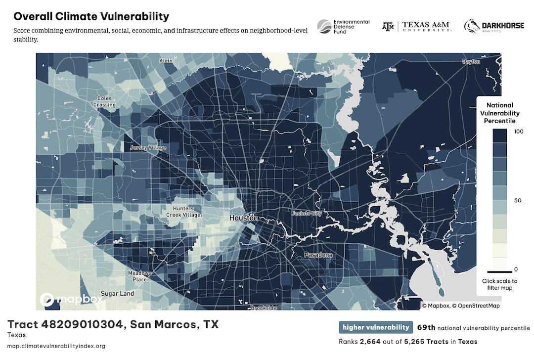
The U.S. Climate Vulnerability Index visualizes how vulnerable 73,000+ census tracts are to climate change and why. Here you can see a phenomenon in Houston known as The Arrow, a cluster of neighbourhoods with greater advantages than the rest of the city. (Environmental Defense Fund)
Tee Lewis, the co-lead author of the Texas A&M paper, said the visualization helps illustrate how things like environmental racism and redlining intertwine with climate vulnerability.
"We saw that the highest ranking neighbourhoods were actually those same environmental justice neighbourhoods that have had to deal with overburdened environmental exposures and long-standing health disparities and that climate was magnifying the risks to those communities," she said.
A stated goal on the CVI's website is to offer "policymakers and communities with the data they need to take action, allocate funding, and advocate for changes they want to see in their own communities." It makes repeated mention of the Biden administration's Justice40 Initiative, a program pledging 40% of the federal government's climate and infrastructure investment benefits to disadvantaged communities. On the tutorials and use cases page, there's even a section on how to use the CVI to apply for Justice40 funding.
The White House has its own climate vulnerability map. Though not as sophisticated a tool, it helped inform the creation of the CVI.
"We looked at the recommendations that White House Environmental Justice Advisory Committee had produced when we were creating the CVI to make sure that we could include as many of those as possible," Tee Lewis said. "I think they've got 40 indicators in there, and we have 184."
There is such a thing as too much data, though. A big challenge in data visualization is cutting out extraneous information, or "noise," Korzan said.
"We had to recognize who our audience was — local communities looking to apply for appropriate funding from the federal government, or possibly policymakers at the federal level looking to impact their community," he said. "Keeping that audience in mind helps us choose which visuals to show at this foundational level of the tool."
Visualizations like this also give journalists a way to tell climate stories. Grist did a story on the CVI that was picked up by several outlets as part of the Covering Climate Now initiative.
What about Canada?
Canada doesn't have a direct equivalent to the CVI. The array of tools available through the federal government's Canadian Centre for Climate Services is perhaps the closest we've come. Its website includes a library of climate resources, a climate-data viewer, functionality to display and download climate data, and more.
"I'm not quite sure where we're at on that and why it's so different in the U.S. than in Canada," Hiltz said. "I think the proliferation of foundations in the U.S. probably helps get those big-level things done."
After Texas A&M and the Environmental Defense Fund published the paper in February, the Darkhorse team spent about four-and-a-half months building the tool with "seven or eight" employees on the project. Hiltz's team felt a value alignment with the clients and saw the possibility of an ongoing partnership.
"We almost interview them to make sure that they have the same values as us. And we tell them upfront that we're going to show whatever the data says," he said. "The thing we look for when we're interviewing for our partners is groups that have this vision of continuing to grow, so we're in it for a longer-term relationship."
Darkhorse is perhaps best known for its Opportunity Atlas, a project for Brown and Harvard universities that correlated income levels with neighbourhoods of origin in the U.S. It has accrued 1.3 million users in five years. A more recent project, Wayne State University's Population Health Outcomes Information Exchange (PHOENIX), is an example of an ongoing relationship between Darkhorse and a client. Hiltz said its next iteration will arrive sometime around Dec. 1.
What's next?
Korzan has a number of ideas for what the index's future could hold, ranging from incorporating as-yet-unreported data to measuring changes taking place in the wake of the index.
"We know even with these 184 indicators, it's still just a little bit of the whole system that drives public health," he said. "I think time could be interesting. If we don't have the data for change over time, how do we capture stories that are coming out of these local communities? Whether they be negative health and climate impacts or positive changes … What are these communities now doing with better access to data to make better decisions?"
Tee Lewis has her own thoughts on what will come next: Getting the word out and finding missing data.
"I've been giving presentations to a range of different audiences," she said. "There is more data every day that continues to emerge … So in the next version of the tool, we are hoping to make it even better."
Darkhorse has a few other visualization projects on the horizon, though Hiltz cited confidentiality agreements as limiting his ability to comment on them. He did say one focuses on entrepreneurship and the other is in the realm of justice. Meanwhile, Tee Lewis has a busy calendar filled with conference presentations and work with the Environmental Protection Agency and Centers for Disease Control and Prevention.
Share